Tuesday, August 12, 2008

Painting in New Mexico

"Morning Near Black Mesa", Oil on Panel, 8x10 inches
Jerry Lebo, 2008


Just a quick note to let you know how painting is going in New Mexico. We are having a great time, painting everyday, and traveling around this beautiful State.


The above small painting was based on a some photos I took the other day on the way to Bandelier National Monument. To get there you travel by highway through the San Ildefonso and near the San Juan Pueblos. You can see it from miles around as you travel in the area. There is also another Black Mesa in the most Northern part of NM--this one is only about a half our north of Santa Fe.


It was early in the day when we passed by, and we stopped on the side of the highway and took some photos--and I made some color notations and a quick sketch. The Mesa actually looks very dark most of the day--but in the early morning it takes on a pinkish/purple quality that was very compelling.


I was reminded what a special place New Mexico is the other day by two of my readers. Cindy, who is one of my collectors, sent a comment on my last post--which reminded me of the uniqueness of the New Mexico landscape--and how the skies here are somehow different. In fact, last year when we were here I wrote a post titled "Top Ten Reasons for an Artist to Live in Santa Fe". I re-read this post and say that the "number one reason" I cited for living in Santa Fe was "clouds". And, I still think the clouds here are the most amazing you will see anywhere. In the morning, the sky here is usually very clear and blue, but when the clouds arrive later in the day, the show is often amazing--and worth the trip alone.


I also got a nice note from Jacqueline Butler, welcoming me to New Mexico. Jacqueline is the artistic director for the organization "Daily Painters of New Mexico". She lives near Galisteo and is thinking about starting a blog and is hosting a workshop for members. So, if you live in the area, drop her a note. Especially if you want to become a daily painter here in NM. I have talked about my own personal views on "daily painting" in previous posts--and I fully support the concept. I just don't think it is for me, personally. My own view is that finding time for "daily painting", is more important than trying to make a painting a day.
So there you go. I highly recommend a trip to New Mexico to paint--or just to look around. I have been coming here for thirteen years now--usually once a year. And I am still inspired every time I visit. Who knows, I may even move here one day. I have met many people who come here for business or some other reason--and fall in love and stay. But, even if you can't get here, you can do the next best thing. Go to your studio and find an excuse to put a fantastic sky in one of your landscape paintings!


All the best, sixtyminuteartist.

Friday, August 1, 2008

Canvas or Panel for travel?

"Juniper View (Study)", Jerry Lebo, 2008
Oil on Panel, 6x6 inches


You have probably noticed it has been a while since my last post. Several of my regular readers have sent me personal emails asking if something is wrong. I appreciate everyone’s concern, but I am okay—nothing terminal yet.

As for the reasons behind my silence, the truth is that I have been dealing with some personal issues--and also have been busy at the day job—including two overseas trips. Fortunately, this has not kept me out of the studio for the most part--and I have been continuing to try to move forward with my work. The important thing is that I am still painting—and keeping my “hour a day” minimum discipline.

The main reason I have not been blogging is that I have not really had much to say. I usually need some sort of inspiration or something to share with my readers in order to get me started writing a post. I don't want to bore people with my random thoughts.

To be honest, I have also been struggling with which direction to take my art. The last few large "color space" painting I finished are sitting around my studio and pushing me to make another one. But, to tell the truth, I have been feeling like doing some small paintings. I am also torn a bit about how to balance my normally "painterly" style against the more graphic approach of my most recent paintings. I realize now that my “style” is something that took me many years to develop--and I am not sure I should simply throw it out. On the other hand, I still very interested in the ideas I have been pursuing in my recent work.

So, why am I posting today? Well, I have a perfect excuse to do some small paintings—and share some ideas with you. We are on vacation in Santa Fe, NM for the next three weeks, and am working with my "portable studio", which is made by Open BoxM. I have written about the traveling setup I use for painting in past posts, and it is ideal for small paintings and studies. So I though I would post a few of these small paintings as they come off the easel over the next few weeks, as well as share some of my tips for painting when traveling.

So here is my first travel tip. When traveling, I recommend you try painting on panels—instead of canvas. First, because panels are easy to pack, and you can buy them at most art stores these days. Most airlines are adding baggage charges for weight and second bags these days—and I managed to fit all my clothes and painting supplies for three weeks into one suitcase. You can also make your own panels when you get to your destination from supplies available most places (I did a post that shows you how). In fact, unless you are planning to paint big paintings—panels are the way to go in my mind.

On the other hand, if you are set on canvas, I have found the best approach is to pack a variety of stretcher bars (taped together) and ship a roll of canvas to where you are painting. That way, you only have to bring the bars, staple gun, and pliers on your flight. If you are bringing large stretcher bars, you are probably not going to be able to fit these in a suitcase, so that means some extra costs. When you stretch your canvas upon arrival (I did a post on that too), leave enough edge overlap so as to be able to un-stretch your work. That way you can simply roll it up and take it home in a mailing tube when you leave.

Okay, so there is a few tips for painting when traveling. For my current trip I decided to use Ampersand Gessobord. These panels are a bit more expensive than the ones I make at home, but not as expensive as some of the others out there. I started using these in my studio about 8 months back—and I am totally addicted. The surface is so nice and has just the right tooth for taking paint—and the quality and consistency is high. I am not paid to promote their products, but I can recommend them without hesitation. The panels come in various sizes (and you can cut them to size). These are widely available these days, so you have probably seen them at your local art store.

So there you go, hope you get a chance to paint outdoors during the summer. And, maybe even get a vacation somewhere so you can paint something new. If so, I will be offering a few tips over the next few weeks—so stay tuned.

All the best, sixtyminuteartist.

Tuesday, June 3, 2008

Where to show your paintings?

"Sweet Escape", Polymer on Canvas, 50x50 inches
Jerry Lebo, 2008


“I don’t paint pictures in hopes that people will understand them. They understand them, or not, according to their own capacity.”

--Pablo Picasso

Okay, so I decided to submit a couple of my recent large paintings to a regional juried exhibit up in Fredrick, Maryland. They wanted artists to submit the actual paintings, so it was a bit of a chore framing and then carrying three very large paintings (the largest was 50x60 inches) 30 miles to the venue. Now the good/bad news, I found out that they accepted one of the paintings (the one in my last post, “These five words…”)--but rejected the others, "Sweet Escape" (above), as well as "Dead Heroes", the painting I put up two posts back. You are probably thinking, hey, you should be happy. You got a painting into a juried show, right? Well, it gets better.

So I go up on Saturday to pick up the rejected paintings and haul them back to the studio--and when I get to the venue I find out that my artwork has been scattered around. One of the paintings is in a closet—with another painting leaning against it—which put a dent into the canvas. The other one is in an office, leaning against the wall behind a pile of other rejections. But, that wasn't the strangest part of it. The woman handing back the work had the "jury sheet" sitting there and was pleased to show me that the painting accepted into the show had a notation next to it...are you ready....it said, "Maybe, if we have room". There you go--critical acclaim if I have ever heard it! I weakly made the point of saying, well, my paintings are rather large--so I understand if there was limited room (hoping for a bit more a positive response), to which the woman replied, "Oh, we have paintings in the show bigger than yours." Thud. I tired again on the way out, “So have you given out awards yet.” You can guess the response—“Oh, yes, they are all given out.” So, I am in the show, but barely--and definitely not the rapturous experience one hopes for.

Okay, so what is an artist to do in when faced with such a situation? The short answer is brush it off. Get back in the studio as soon as possible and get painting again. I have seen artists send work to many galleries over the years, and most do not even get a polite rejection letter. Getting a form letter can be an achievement. With a juried exhibit, politeness is probably the best you can hope for. Even if you get your work into a group show or a gallery, you can expect that your work will be treated for what it is from a gallery perspective...a commodity—and I have heard of many cases where galleries have damaged work due to haphazard handling. Other artists are your worst enemy, as they tend to treat other artist's work with little regard (if they are not looking). I am serious. If you don't believe me, watch what happens when artists bring their work to a critique or for submission to a juried show--if no one is looking, other artist will not hesitate to move your work or treat it in a very haphazard way. I have seen it. To a gallery, you are just one in a long line of eager artist to get their work shown, so don't be surprised if a gallery generally acts like you're work is replaceable. At least until it sells for $50 grand or so--they tend to get more careful at that point.


I think my recent experience also shows some important points to take into account when you think about where and how to send your work out. First and foremost, it is important to find a gallery or event that is interested in work and represents similar artists and/or types of work. I wrote about this early in my blog. But it is worth repeating. If you are painting "cowboys and indians", don’t send your work to a New York gallery—you won’t garner much interest. However, the good news is that they may be very excited in Tuscon. In the end, you need to decide before sending out work if it is likely to appeal to a certain gallery or jurist. In my case, I think it was the fact that my paintings were so different from all the other painterly and more formal painting that was submitted to the show, that it simply did not fit with the show or what was running through the jurist's mind. You want a show that hangs well together--not necessarily to show every type or style submitted--even I can understand that.

Anyway, I thought I would share this experience, so you will be prepared. I know some of you are thinking about trying to break into galleries and submit your work to a show. If you are interested in reading more about how to better showcase your work and build your career as a visual artist, I will again recommend Cay Lang’s book, “Taking the Leap”. I have mentioned it several times in my blog, but it is a great book. I went back to reading it again after my recent experience, and I could quickly see some of the mistake I made in submitting work to the regional exhibit. First of all, as I previously mentioned, these types of modern, hard edge, “color space” paintings don’t really fit the style of the venue or the other art being shown there. So a tepid reception was probably inevitable. Second, I don’t think they together really represent a cohesive artistic statement yet—since they are still evolving in terms of style and technique. This is not to say they are bad paintings, they are perhaps not quite ready for full public exposure or it was not the right venue. Anyway, live and learn.

I hope you got something out of my experience that will help you build your career as an artist.

All the best, sixtyminutearist.

Friday, May 2, 2008

How to Start a Painting?

"These Five Words in my Mind"
Polymer on Canvas, 60 x 50 inches
Jerry Lebo, 2008

“The progression of a painter’s work, as it travels in time from point to point, will be towards clarity: toward the elimination of all obstacles between the painter and the idea, and between the idea and the observer.”

--Mark Rothko

I though this was a fitting quote for the above painting—and relates back to my own experience lately. As you know, I have making a radical change in my painting style over the last few months, and I have been getting a lot of questions as to “why”? The short answer can be found in the above quote—in that I felt a real need to simplify my work and eliminate the obstacles between what I was trying to say in my paintings—and to send that idea more directly to the observer.

The above painting, “These Five Words in my Mind” was motivated by a very simple idea that I had been thinking about for a few months—that is, how do words and colors relate? And could you make a painting that had the effect of words—in terms of evoking a response of the observer? And how could you change the colors and shapes to change the meaning and sensation of a painting?

Let me explain. Let’s say you have five words. There are a lot of different things you can say with those five words. Change one word, and you can chance the entire meaning of what you are saying. Take, for example, the two phrases, “I would hate to love you”, and “I would love to hate you”. These phrase contain the same six words—but you immediately feel different depending on which one is said. In a way, color is the same way. You can make a lot of different paintings with a set of five colors—and if you change one color, the entire sensation will also change. Of course, most paintings have dozens or thousands of colors—but do they need all of them? Which ones are important to send the meaning? And which ones will change the meaning of the painting—these are the questions I was asking myself when I thinking about the above painting.

For this painting, I purposely chose five colors you would probably never see reflected in water—and except the blue—would not likely make anybody think “water”. Then I tried to make a painting that said “water” on one hand through the subject matter—but in a very minimal way. In fact, the main purpose was to combine five colors into a certain sensation—that is to send a sensation through a certain color “note” or harmony. Also, I used shapes moving from larger to smaller (and hard edge to soft) to give the painting a sense of moving back in space—so that the five colors soon become “color”, “space”, and “sensation” all at the same time-(by combining in your eye)—just like a certain phrase would (or even five music notes) do as they are uttered or played. You cannot hear the individual words or notes—only feel the sensation. I know it probably all sounds pretty crazy—but that is what I was thinking about before I started this painting and while I was painting it—the sensation of five words running around my head.

Okay, so how does this relate to the subject of this post? Well, I have been thinking a lot about how paintings communicate and what that means for how artists might approach their paintings. One of the things I think is important is that an artist at least be clear about the motivation for painting before moving to the easel. I have heard instructors say that you must “have one idea” or that you should “focus on the main idea of the painting” while you paint. I have known that to be true based on my own experience. When I start to paint with one idea in mind (say, capturing the feeling of a sunset) and then start focusing on something else half way through (such as the the color of the mountains)—it is more than likely going to led to a bad painting. The fact is, that a successful paintings are those that deliver a clear message to the observer—as simply as possible. If the artist is not clear—how can he/she expect the observer to see it clearly?

So what does this mean for starting a painting? Well, obviously, I think the first step is to make sure you know what you want to say before you start a painting. That is, do you want to say something about something you are seeing, feeling, or something that pleases you visually? Keep that idea in your mind as you plan and work on the painting. Make it as simple as possible. My experience is this simple approach will lead to better outcomes. Successful paintings require a lot of pre-meditation. Many painters and students focus so much on the mechanics of painting—color mixing and drawing—they forget about the “why”.

So next time you are about to start a painting. Take a few moments to think about why you have chosen the subject. Ask some hard questions about what attracts you to that subject or landscape. Really work through your motivation for starting a painting—before you start mixing colors and drawing on the canvas—and stick with this idea throughout. Try to get that idea onto the canvas. When you step back from the canvas, ask yourself not if looks like the subject matter—but if it feels like it. Not if the drawing is good, but if the sensation is good. Does the figure feel like it is standing? Not is the gesture correct, but does it feel correct? Why is this important—because when the observer sees your work—this is what he/she will feel right away more than any amount of good drawing or careful color mixing. The idea or message of a painting comes to the viewer in one quick moment as a feeling (like five spoken words)—and so you need to be sure that you are communicating and assessing your paintings at that level.

Okay, I know this is a bit touchy feely for some of you. But I hope you got something out if it.

All the best, sixtyminuteartist.

Wednesday, April 16, 2008

Using Color References

"Untitled" (Study), Polymer on Paper, 17 1/2 x 23 Inches
Jerry Lebo, 2008


The weather is getting better in DC, so I have been able to stroll around during my lunch hour and take a few pictures that I can use as reference material in the studio. I am thankful for my digital camera—not only can I look at the picture right after it is taken—but I can take hundreds of pictures and then simply delete the bad ones. I end up throwing out most of the pictures I take, in any case. In the past, I used to pay to develop a whole roll of film and then throw out the majority of the shots. So I love my digital camera.

Anyway, the above study is one of the paintings I am thinking of making into one of the large “color space” paintings that I have been talking about in my blog recently. The study is based on a photo I took last week when I was walking near the Hirshhorn Museum. I like the unusual composition—and thought it would be a good opportunity to explore various color harmonies.

I usually do these sorts of painting studies using acrylics and sometimes oils (I gesso the paper for oils). I really struggled with the color relationships in this study and it took me quite a while to figure out how to get the effect I was after. The reference photo and painting are quite different. I have put the reference photo below so you can see the changes I made—basically I re-worked the entire color harmony in pursuit of what I have been talking about recently—that is, how to evoke a certain psychological response in the viewer using color.


One of the problems when moving from a small study to a large painting is that a painting that looks good small—may not look good in a larger format. The reverse also holds true, that a large painting may not be very interesting if painted in a smaller format. You have to decide to “go big” or not based on a smaller studies—and it is not always easy to imagine the effect. Anyway, I am thinking of trying the above painting in a large (50x66 inches) format—what do you think? Send me a comment.

Okay, so let’s get to the point of this post—which is how to use “color references” in the studio. I have increasingly found that I am nearly blind when it comes to color. I know that sounds strange—but the light in my studio is always changing, my mood changes, and even my sight seems to change when I am in the studio. I look at a color at one moment—and it looks greenish—and then two minutes later it looks to have change to a bluish color. I have written about this in some previous posts—but I think color is the hardest part of being an artist. It is such a moving target—even for a trained artist.

One solution I have come to increasingly rely on is the uses of color reference materials. That is, pieces of color that I have lying around my studio—that can serve as a neutral reference point. For example, in just moving from the easel to the palette—sometimes my thoughts about a color change. I might think I have the right color when I am mixing it on the palette—and then get to the canvas and change my mind. So which color is right? The one I was seeing on the palette or the one I have on my brush? It depends, of course, on what color I was after. Which I might have forgotten by the time I am ready to make the stroke—since I am daydreaming about something else most of the time anyway!

Color references don’t need to be expensive or complicated. They can be pieces of paper you paint yourself—or colored paper that you buy. You can use a color matching system—such as Pantone—or make up your own system. Color charts are also a popular way of color referencing—and can be keyed back to the paints you are using. Basically, what you want from a color referencing system is something that you can refer to that is unchanging! Examples of color references that I have used in my own studio include PMS swatches, color-aid paper, and premixed color charts.

The key to using a color reference is to understand what it can—and can’t do. A color reference is not a solution to a problem. It is not a preset color harmony that you can use in a painting (I don’t think this is possible anyway). The benefits of a color reference system in my mind are two. First, it is a tool you can use to work out how colors (and values) will affect each other before you put them onto the canvas. In some ways, this can lead to new color harmonies—but in my experience it can also keep you from mixing the wrong colors or going in circles. Second, and in my mind equally important, color references can be used to bridge the gap between the color you are seeing in your mind and the one you are mixing on the palette. For example, when you think “blue”—what blue are you thinking about. If you can pick out the “blue” you want from a color reference system before you start mixing—then you can more quickly know if you mixed the right color.

If you are not convinced yet—try this experiment. Think about a color you want to use in your paintings. Say, a sky color—or the color of the grass on a sunny day. Next time you are in the studio—try to mix it. Or, better yet, look out the window and mix it based on what you are seeing. Once you have mixed the color, put it aside for the moment. Next, find a piece of paper or other reference material that is as close as possible to the color you are after. You can again compare it directly (by holding it up to the window, for example). Now, mix the color again but with the reference color sitting on your palette. Now go back and compare the color you mixed when you did not have the reference—and the one you mixed when you had the reference nearby. Which is closer to the color you were after? I think you will see my point pretty quickly. Having a neutral reference can get you closer to where you are going--and faster.

I am a strong believer in having as much information around you as possible when you are in the studio. Photos are an accepted material for artists to use. But this is only one form of information—and not a very good one at that! I also am a firm believer in color references. There are numerous ways to use these to improve you paintings—color mixing only being one.

Okay, that’s it for now. Go to the studio and paint. All the best, sixtyminuteartist.

Monday, April 7, 2008

Finding the Shadow Color

"Dead Heroes", Polymer on Canvas, 47 x 66 inches
Jerry Lebo, 2008

I have been busy over the last few weeks working on several large paintings, which has proven to be a big challenge. The above painting is the first to come off the easel, and is about as big as I can effectively paint in my basement studio. Here is a shot of what it looked like on the easel, to give you an idea of the scale.


As you can see, I am continuing to pursue the approach I started in the painting of our dog I showed you in my last post. The intent is to push the color harmony ideas I have been talking about over the last few months. That is, to bring together the color interactions in such a way as to make a psychological “color space” which is integral to the subject and message of the painting--and transforms the viewer's experience.

The painting itself is based on a photo I took this summer at the World War II memorial here in DC. I made a photo album for my Great Uncle who recently died—as he was too ill to travel to see the Memorial himself. The picture is of one of the waterfalls that they have at each end of the memorial (one each for the Atlantic and Pacific Campaigns)—this one being the Pacific. My Great Uncle was in the Pacific during WWII—and survived the sinking of his ship and his shipmates being eaten by sharks. I have fond memories of how he used to tell me war stories. He is one of the big influences of my youth—always around during the summers I spent in Indiana as a kid. He died a couple of months back after a long battle with prostate cancer. I will miss him--and I suppose the painting is a bit of a memorial to his memory.

Okay, so back to the subject of the post—painting shadows. This post has been lurking in my mind for a couple of weeks--and is motivated by one of the key issues I see people struggling with in their paintings. Often we stand back from the easel--and wonder what is wrong with a painting and think "color". But, which color? Most of the time we look at the higher value and high chroma hues and start messing around with those--but in fact it may be the shadows that are the problem. Frankly, I see this over and over in my students work--they pay a lot of attention to the colors where the light is hitting an object or the landscape--but then mix up some pretty boring, or even plain bad, shadow colors.

The first message I want to get across is: shadows are colors! Let me say it again another way: the color you are putting in the shadow is just as important as the color you are putting on the highlight. If either one is wrong--the painting will suffer. Okay, so how do you find the right shadow color? Well, first, you need to be able to see the shadow color. So let me give you a little exercise that I have learned that will help developed your mind and eyes to better see shadow colors. If you do this exercise regularly, it will improve your painting. I promise. It is a little exercise I call, "find the shadow color".

The exercise starts by finding a piece of paper that is a single color and at least around four or five inches square in size. It doesn't matter where it comes from--out of a magazine, book cover, or simply paint a piece of paper. Next, take the piece of paper and put it a few feet away from you in a location where it is being hit by light. It can be natural light coming in from a window (if you are in the studio)--or light from a lamp. Doesn't matter. Once you have your color/paper sitting there, take a moment to really notice the color. Take a long look--try to remember what it looks like. Is it warm or cool? What is the hue? Try to memorize the color.

Next, take the same piece of paper and put it somewhere nearby where it is not being hit by light--but the color is still observable (not in the closet!). For example, if you had the paper sitting on a table, put it on the floor next to the table in the shadow of a table. If it was in the light coming in a window, put it in a place where the light is not directly hitting it. Notice the change in color. Take a long look--try to remember what the new color looks like--how did it change when you moved it out of the light? Did it get warmer or cooler? What is the hue? Again, try to memorize the color--and think about how it compares to the color when it was lighted. Move it back and forth between light and shadow and notice what happens.

Okay, now the fun part. Go and find another piece of paper (or paint one) that is the color of the paper when it is not being hit by light. This is a lot harder than it sounds. I did this in my office the other day and it took me a good fifteen minutes to find two objects where the color of one was the shadow color of the other. The test that you have the right color is simple. Put the two pieces of paper in light together, then move the original piece (the one you first chose and observed in light) into the shadow. If you have the right shadow color, the two pieces of paper should appear to be the same color.

Below are some pictures to give you a better idea of how this works. The first photo below is of the two pieces of paper that I determined were shadow and highlight colors. They are actually the covers of two publications I had sitting around my office. This is how they look sitting on my desk as lighted by the lighting in my office.


So, how do I know that the darker color is the shadow color of the lighter one? Simple, I put the lighter color on the floor off the edge of my desk so that I could see them next to the other. In effect, so that the darker one was in the light, but the lighter one was in shadow. Below is a photo of the result--taken with the darker one sitting on the desk and the lighter one on the floor in shadow.


You can see that they have effectively become the same color. And, yes, the one on the floor is the lighter color in the above photo. Hard to believe I know.

Try this exercise in various lighting conditions and types of light. Finding two colors that work may be a bit of a struggle at first, but you will get better at it. If you do it as a regular exercise, you may be surprised how it improves your ability to paint shadow colors (the first thing you will notice is that shadows are colors--and they have predictable relationships!). Your mind will remember how colors in shadow and light relate--which will make you quicker at finding the right shadow color.

There are a lot of variations on this exercise that can help you out in the studio. For example, say I was painting a still life with an object in it that I was having a hard time finding the right (or even simply believable) shadow color. A simple guide might be to paint a piece of paper the color I was using for the object in light, and another piece the shadow color I was using. Then I could do the same as I did above to compare the shadow color to othe other paper "in shadow"--and if the relationship was correct. Even if the match was not perfect, I would expect the temperature and general hue would be in the same range. If the two colors are off--you will see it pretty quickly--trust me.

One of the things you will notice right away is that the shadow color of something in natural light is much cooler that a shadow of the same object indoors under normal house lighting. Which means, for example, that the relationships indoors are different than those you would see if you did the same exercise (with the same colors) outdoors. Which means that if you are painting landscapes, use natural lighting for the exercise--and preferably do it outdoors. Also, the shadow color of an object will vary with the distance you are away from it. So, if you move one of the pieces of paper closer or farther away from you--the relationships change. So, think of it as a way to train your eyes and guide your thinking--not a scientific experiment.

So there you go. A simple exercise to help you explore shadow colors--and to get better at seeing. Hope you find it useful.

All the best, sixtyminuteartist.

Friday, March 21, 2008

Improve Your Studio Lighting

"Losing a Whole Year", Acrylic on Paper, 18x24 inches
Jerry Lebo, 2008


I am sorry that I haven't posted in a while. I am not sick again. To tell you the truth, I simply decided to spend more time in the studio--rather than blogging. This has given me a bit more time to explore new ideas--and I did not have much to write about anyway. The last four weeks or so have been pretty much failure after failure in the studio--until last week--when I started to make some breakthroughs. But, I must admit that I painted some pretty bad paintings in the meantime.

I think my new approach in the studio is rooted in my previous postings over the last six months about color and perception, which always get me thinking about what I am trying to do with color in my paintings. I finally decided to take the time to explore some new ideas about how colors relate and how they can make space and visual sensations. As you can see from the above painting, it is already impacting what is coming off the easel. I am much more focused on color and how to simplify what I am trying to say. My intention has been to create what I call “color space”, which is a set of color interactions that create a certain psychological response in the viewer. In my mind, this is at the root of all good paintings. At least the ones I like.

Okay, enough about that for now. The reason I am posting today is that I have received several emails recently from readers inquiring about studio lighting, so I thought I would share some thoughts on this issue.

Let me start by saying that, by far, the most common mistake I see with studio lighting is that there is not enough of it! Many artists are forced to work in upstairs bedrooms or office spaces--and the light is usually much too low to effectively see colors and values properly. I also see a lot of people using lighting that is the wrong color (temperature)--typically too warm--which is what the standard household bulb provides. The fact is that the average number of windows in a house/apartment simply do not let in enough light to effectively work as an artist--so there is nearly always a need to add additional lighting. Many people hear that the best light is "northern light", which is true (if you happen to have it)--but there are things that are more important than having northern light--the first of which is to have enough light. You can make do without northern light--but not too little light.

If you have good windows--regardless of the direction they face--the first key is to keep direct sunlight off your canvas and work area when painting. This is also true when you are painting outside. If you are painting with direct sunlight on your canvas or palette--it will distort your perception of color and value (it warms them)--not to mention that it will make you squint. So indirect light is better than direct light. Whether you are outside or inside--if direct light is pouring into your work area--I have always found the best approach is to turn your easel so that the direct light is coming at a 45-60 degree angle to one side of the canvas/easel--so that it is not behind or directly in front of your canvas. If your looking at a subject that is in to the left of your easel, for example, then the sun should be keep on your right side just out of your peripheral vision (say, 60 degrees)--but not so far as to cast any direct light onto your canvas.

If you are building a studio, or have your choice of rooms, the ideal situation in a studio is a high level of natural indirect light--which is why people talk about "northern light" as being the best source. The sun moves from east to west during the day--and moves from north to south (toward the equator) as it the season moves to winter. Thus, northern light (in the USA, but not if you live in the southern hemisphere such as in Australia) is the only 365 day per year indirect source of light. That said, it is not only the side it comes from--but the amount, as I have said. Thus, a large western window in your studio is better than having a small Northern window--since at least in the morning you will be getting a lot of indirect light.

Okay, so what to do if right now to improve your studio lighting? Without knowing your exact situation, the size and types of window, and time of day you typically paint--generally you want to maximize the indirect sunlight--and avoid direct sunlight. If you have good natural light--the best orientation for your easel is probably away from the window--so that you are maximizing the amount of natural indirect light hitting your canvas. But, be aware that if you have a western or eastern facing window, the amount of light coming will increase at some point during the day and eventually for some period be coming directly into your studio, so you may have to add blinds and/or be able to turn your easel away at an angle, as I have suggested above.

Natural light aside, my overall suggestion to most artists is to add more artificial lighting to their studio--but make sure that it is as similar to daylight as possible. This can be halogen, incandescent or fluorescent--depending on what you prefer. The key is to look at the Color Rendering Index (CRI) and Kelvin (temp.) of the bulb you are using. Check the manufacturer's web-site or the packaging to find this information. If it doesn't say--don't use it.

For reference, remember that natural sunlight has a CRI of 100 and Kelvin of around 5500--which is a bit blue in color. The normal light/lamp bulbs you buy at the store have a Kelvin of around 3000 (and a low CRI), which is why they make everything look warm. Many halogen bulbs are also made this way--since bulb makers have learned that people generally prefer warm light. You want to use a bulb that is a least a 90-95 CRI and not less than 5000 kelvin. There are halogen lights in this range that are not too expensive--I personally use four fluorescent bulbs at 5000k and 96 CRI. You don' t have to buy one of those expensive "art lights" or other bulbs sold at art supply stores. There are plenty of places that sell natural lighting--and you can get it a lot cheaper. Be aware that not any bulb called "natural light" or "full spectrum" will work. Again, check the CRI and Kelvin. If the package or web-site does not provide the CRI and Kelvin of the bulb--then don't buy it.

I find that my studio lighting always feels a bit blue to me--since the light elsewhere in the house is warm. Don't be alarmed if you notice this effect. Natural sunlight tends toward blue--that is why shadows outdoors appear cool. They are only getting indirect (reflected) light from the sun--which is cool. Direct sunlight is warm--which is another reason to keep it from directly shining on your canvas--it changes the colors.

One test you might try for your lighting is to take a picture of a piece of artwork using a digital camera with the flash disabled (use a tripod since the exposure is long) under your studio lighting. Then take a picture of the same piece of artwork outside in reflected natural daylight (not direct light). If they look pretty close in terms of color, then your studio lighting is similar to "northern light", since all that means is an even indirect sunlight.

Get more lighting in your studio--you can never have too much--only the wrong kind.

All the best, sixtyminuteartist.

Friday, February 22, 2008

Improve your Color Harmony

"Winter Pines", Oil on Canvas, 20x12 inches
Jerry Lebo, 2007


I apologize for not having posted to my blog in a while. As some of you may know, I was traveling during January--which partly explains my silence. But I also managed to catch a case of “Dengue Fever” while visiting one of several tropical locations on my itinerary. There were only about 100-200 cases of Dengue Fever in the US last year—so most doctors don't even know how to treat it. I fortunately had access to a good doctor and have slowly recovered. But it has set me back in the studio and blog a bit—as I have been not been able to do much over the last three weeks.

Anyway, I am back in the studio and thinking about art--and I am very excited to be back blogging. I plan to use my blog over the next few week to talk about color, which is a topic my students are asking a lot of questions about these days. So, I plan to post some of the ideas and lessons I am sharing with them--and I hope you will be able to take something away that you will be able to use in your own art.

The first issue I want to talk about is "color harmony". In my experience, beginning and intermediate artist are always looking for a solution to color problems. Their colors look dingy, or their paintings don't have any spark--and look drab or dull (especially next to other artist's work). Or, their color is way over the top and looks gaudy and/or disorganized. They discover that painting like Monet or Matisse is not as easy as it looks.

After enough frustration, an artist will typically seek out new ideas (usually go to the bookstore or sign up for a class) and soon discover "color triads" and the famous "color wheel"--and various other color systems--and soon think that there is a formula or book they can read and learn about color. They buy books called "color harmony" or "color for artists" and read them carefully, then they go back to the studio and try out various ideas--and perhaps their paintings get a bit better--but generally they end up unhappy. The core reason is simple, there is no way for another person to give you advice about what color you should use—or what will make your paintings better. You have to discover it yourself. Color is a personal experience--and what one person likes about color is not necessarily what you will like. Also, learning how to use color requires an active engagement—not a passive one. You cannot learn about color by reading a book--you have to look and learn visually.

This leads me to my main hypothesis, the main reason I think artists struggle with color is simple: They don't spend enough time working with it in an active way. I remember when I was studying at the Washington Studio School—no one talked about color. Everyone talked about painting and drawing—but color was assumed to be something you knew about. We talked about values—but never really talked about how and if color became important in painting. Not surprising I have spent a lot of years struggling with color in my own painting. Anyway, I am going to try to talk about some of what I have learned over the years.

The first issue to understand is that the human eye is very sensitive to color and can see millions of colors--while it can only see a much narrower band of grayscale value (some think about a hundred values). At the same time, the eye is easily fooled by color and finds it difficult to see the difference between colors. I know this sounds contradictory—but it is true. They eye can see a lot of colors, but at the same time has difficultly seeing differences between two colors—and (as I have mentioned before in previous posts) the eye has a hard time seeing value and color at the same time.

I was doing an exercise with one of my students the other day where she had a series of red color chips taken from the Munsell Student Color Set. These are basically value and chroma combinations in one color range, in this case red. If you look at these chips all in a pile, some of them look very close in value and color—and are vary hard to tell apart. I took two of the chips that appeared very close in color/value and put them on top of a larger swatch of red color in a reproduction of a painting. One of the chips was very close to the color in the book, but when the other chip was put on the color—it was clear that it was remarkably different. So how can two chips that look so similar sitting together on the table—look so different when placed on large swatch of a color. The answer is—without a reference point—your eye finds it very hard to decide the difference between two colors. But, once you have a reference color—it has the effect of accentuating their difference (I talked about this effect in a previous post). In fact the difference can become so glaring that you will feel stupid you couldn’t see it before. Try it sometime—mix two reds that are close in value and chroma—perhaps one-half value step apart. Then paint a piece of paper with one of the colors. Put the other color on top of it. The difference that was hard to see when comparing two piles of paint—will become obvious when one color is on top of the other.

Okay, so what does this have to do with color harmony? The point I want to make is that when an artist goes to mix a “red”--there are thousands and thousands (if not millions) of variations in red to chose from--and believe me (I have tried it), a small change in color can make a big difference in what happens in your paintings. And, where is the reference for the right color? In your mind? If you get it wrong by just a bit--you may take your painting in a whole different direction.

Don’t believe me? Next time you are at a museum buy a reproduction of a painting you like—and then mix a color that is just slightly off of one of the colors in the painting (it doesn’t even have to be that much off). Paint over the reproduction with the “slightly off” color and then stand back and look at the painting from a distance. I think you will see very quickly that even a slight change in color can have a big effect in the overall look and feeling of a painting. Color is strange in this way—you have to mix the right one out of the possibly millions of choices or you won’t get the effect you are after. I think this is one of the biggest hurdles to improving color in paintings—taking the time to find the right color—not the “close enough” color. Most artists are in a rush to paint. Thus, rather than finding the right solutions—they stop at something “close”.

I will be giving you some exercises to help with color over the next few weeks. But, let me first say that learning about how to use color is a lifelong pursuit. If you have been following my blog, I have been talking a lot about values and working with grayscales. If you have been doing the exercises that I recommend, you have seen how hard it is to learn to see grayscale values. Well, mastering color is much harder than grayscale values. In fact, the problem with color is that there is no scale, formula, or system that you can use to learn about it. As Albers says, it is purely a psychological experience--and thus a moving target. Even your own sense and taste for color will change over time--so there is no way to learn a system and then walk away. It will be an on-going challenge that can keep you busy for a lifetime.

Okay, before I close let me give you a simple exercise to get started working on improving your sense of color. This is one I often use myself. First, find a reference—a colorful photo or some colored paper—or even a painting that has been reproduced. Look for a reference that has clear areas of color to work from—that is, areas of color large enough so you can make direct comparisons. Pick a color in your reference and try to mix that color on your palette. Do this exercise with the photo sitting a foot or so away from your palette—so you can see it, but not make a direct comparison while mixing. When you think you have it matched, compare the mixed pile directly to the photo reference. How close did you get? Don’t settle for "close enough"—try re-mixing until you have an exact match. If you have never done this exercise before, I would be surprised if you can even get it exact on the first try. If you are struggling, move the photo reference onto your palette so you can make a direct comparison while you are mixing—I bet it will be easier to get close. But even with the reference sitting there on your palette--you may struggle to get an exact match. Okay, here is the final twist. Do the exercise with a limited palette (say, blue, yellow, red, white). See how close you can get with only the primaries--that is my favorite way to do the exercise.

I recommend you do this exercise until you have mixed 5-6 different reference colors. If you feel it is too easy—time yourself. See if you can make a perfect match in less than two minutes or less than one minute. Or move the reference further away from you. I know that may sounds strange, but I believe that just taking the time to mix colors will improve your painting. If you do this as a warm-up every day before you start painting—you may be surprised with the result. You should soon not only be able to mix the color you want more closely and more quickly—but you will soon realize that you are able to see the subtle differences between various colors much more clearly as well. You will also be better able to remember colors that you have mixed in your minds eye.

Okay, that is it for now. There is much more to be learned about color, but this is a start. I will give you some more exercises in coming posts. Now, go to your studio and paint.

All the best, sixtyminuteartist.

Wednesday, February 6, 2008

Painting from Photographs

"Evening Sky Study", Oil on Panel, 8 x 4.5 inches
Jerry Lebo, 2007


Two posts back I showed you a simple exercise to help see grayscale values more clearly by painting directly on a printed photo. If you have tried this exercise, you have probably noticed that it may not lead to a very interesting result--at least not something that you would want to hang on the wall. There are several reasons. First, as Josef Albers points out in his book, "Interaction of Color", photos lose the finer nuances and delicate relationships that one would see in nature. Put another way, there is much less information to paint from when painting from photos in comparison to standing outside and looking at the real thing.

Another problem with painting from photos is that photos distort value relationships. If you have every compared a photo of something to the actual subject, you will have seen that colors change, and values tend to merge together. For example, the shadows in photographs tend to darken and simplify—and the lightest lights tend to get higher in value and merge together. If you want to test this—try this experiment. On a cloudy day, look up at the sky and take a few minutes to notice the all the shapes and value changes you can see. Then, take a picture. You will see very quickly (assuming that you did not apply a variety of photo filters and exposure techniques) that the subtle variations will be lost in the photo. In some cases, the sky may simply become a single value. As Alber's puts it in his book:

"…photography registers all lights lighter and all darks darker than the more adjustable eye perceives them. The eye also distinguishes better the so-called middle grays, which in photography after are flattened if not lost."

There are other distortions taking place in photos that are less obvious. For example, take a picture of the Grand Canyon and print it out as a 4x6 print—do you think that the photo will give you the same sensation as standing at the Grand Canyon--obviously not? A photo is much smaller in scale than the real thing, so the physical sensation and peripheral sensations of standing there are lost. This is in addition to the value and color distortions I mentioned above. It is no wonder people's eyes glaze over when you show them vacation photos—these are a poor substitute for the real thing.

This brings me to the point of this posting. That is, that a good painting has to convey something to the viewer--and a direct reproduction of photo is unlikely to provide the necessary information to convey that sensation. Another way to think about this is to consider paintings that you like--and compare them to photos you have seen of the same thing. For instance, would you prefer to see a Manet painting of a bowl of peaches—or a photo? What would it take to make a photo of peaches as interesting, or better, than a painting? As Edgar Payne says, "A pictorial representation (painting or photo) is always a translation." The art is thus in the translation. So, if you are going to paint from photos—don’t rely entirely on the photo—think about the translation.

There are of course many ways to translate visual ideas in paint, and I am not going to be able to say much in a few paragraphs. Instead, let me focus on some ideas to help you if you are going to paint from photos in your studio.

1. Don’t lose your focal area. A good painting needs an area of emphasis, or focal area. One of the problems I see in photos, since they tend to distort values, is that they may lose or even move the artist’s intended focal point. For example, in landscape photos the far shadows darken and tend to draw undue attention. In other cases, the subtle changes in values that naturally occur in photos will reduce the emphasis/complexity out your intended focal area. Or, the opposite could occur—where more than one point of emphasis emerges (for example, due to a over-darkening of a secondary shadow). Think back to what drew your attention when you took the photo—and work to ensure that that is the focal point in your painting. Don’t rely on the photo too much.

2. Add variation in shadows. I can almost always tell a painting that has been painted from a photograph—mainly due to the darkness and simplification of the shadows. The most common mistake I see is either to make the distant shadows too dark—or the near shadows too simplified (and dark?). Put an object on the still life stand and take a picture. If you compare the photo to the actual subject—you will see there are subtle value and color changes in the shadows that will lost in the photo. If you are going to paint from the photo, you will need to put these back. If you hold your photo directly under a bright light, you may still be able to see some of the subtle changes that were actually there. If not, I recommend mixing a least three shadow values (two of which will be a half value step or so above the darkest value you plan to use). You should use these higher two values for the majority of your shadow area(s). The darkest value can then be used as an accent as needed—noting that the darkest values tend to occur where two objects meet. A cast shadow will always have some reflected light in it, so will never be the darkest dark—despite the fact they may appear that way in a photograph.

3. Reserve your highest highs. Just like shadows, the highest highs in photos tend to brighten and merge. Thus, do the same as you would for shadows. That is, don’t use white or near white values right off the bat. Start by taking down the highest values in your photograph by least 1 to 1.5 value steps. For example, the sky in most photos will appear to be nearly white—but if you look outside—the sky is usually 1-2 value steps lower (hint: hold a white cloth out at arms length and look at the sky--which is darker?). Also, the local color of the highest values in your photo may be lost or distorted—that is, they will appear washed out. You may thus need to add a bit of color back into these areas (the color of the sky on a cloudy day is not white). If you don’t’ know what color to add—start with the local color of the object and the color of your light source. The highlight is usually some variation of these.

Let me close with a quote from JF Carlson from his book on landscape painting where he says, "We must not train our eyes to copy tone for tone, but think of the bearing of such colors and harmonies up the main idea of our picture.” In other words, the problem with painting from photographs is not only that they are not an accurate record of values and/or colors—but a good painting is more than a direct copy. It is a translation of reality. So, when painting from a photograph, always keep in mind the sensation and idea that you are trying to communicate—and adjust your value and colors based on what is needed to covey that to the viewer. Don't be a slave to your reference photos. Even if you managed to get it perfectly correct, it is not likely to result in a compelling painting, so go ahead and loosen up.

Hope that is helpful.

All the best, sixtyminuteartist.

Friday, January 18, 2008

Selling a painting--who gets the image rights?

"Canyon Sunset (Study)", Oil on Panel, 8x10 inches
Jerry Lebo, 2007


I received an email the other day from one of my readers asking what appears to be a straightforward question. A local business wanted to commission a painting, but also wanted to use an image of the painting in their promotional material. Furthermore, they wanted to be able to manipulate the image for various uses—in this case, they wanted to change the colors to fit with a boy or girl theme. My reader said that there wasn’t much information on the internet about this issue—and wanted my thoughts. I did a bit of searching on the internet and found there was some information—the problem was that most of it was wrong. So, I thought I would do a post on this issue, so others might benefit.

The first thing you need to know is that when an artist sells a painting, they are not selling the rights to use the image in other forms, such as on web-sites, promotional material, business cards, etc. An artist retains all rights to the image when they sell the painting. Under US copyright law, using an image of an artist's painting requires written permission from the artist until 70 years after his/her death.

You should also understand that rights to the image have value that are separate from the painting itself. For example, if you own the rights to an image, you can make prints and sell them. In other words, if you were to sign over your rights to the image, the person who purchases these rights could, in theory, go down to the local art fair (or in their store) and sell framed prints of the image for whatever they think they can get--and you could not stop them. If they have full ownership to the image rights, the can even sell those image rights to someone else—or even more than one buyer! If the image gets popular—the rights could be worth more than the painting.

So what if you put your paintings in a gallery? Galleries will often require you to allow them to retain the image rights during the period they are selling the painting so they can advertise it on their web-site or in print. This would be spelled out in the contract you would sign with the gallery--since these rights are not the same as owning the painting. Usually, once a painting is sold, the rights to the image revert to the artist--unless it was agreed the gallery would retain them.

What about commissions? I saw a lot of advice out there on the Internet that said that if the work is a “commission”, the buyer of the commission has the rights to the image. This is not always true—and in most cases where an artist takes a studio commission—it is not the case. Under US copyright law there is a clause that relates to what is call "work for hire". The “work for hire” clause applies when you are working as a freelance artist and supplying work to an employer—in which case the employer gets both the work you create and the rights to the image. Your employment contract would probably have a clause to this effect in any case. Some artists interpret this as "if it is commission, the image rights go with the painting." This is not true—unless you actually agree to this in the commission contract. Here is a link that explains when a painting is a “work for hire” and when it is not:

http://www.copylaw.com/new_articles/wfh.html

Okay, so what does this mean for an artist who has a client that wants to buy the painting and also use the image? First, you have to judge the situation and decide what is important to you--and think about the risks of granting the rights to use an image. Minimally, you should have a written contract with the person using the image covering the limits of the use of the image. There are sample contracts out there—typically in books which provide sample legal forms for artists. The language of these contracts can be quite daunting—when they talk about “moral rights” “resale royalties”. But there are some good web-sites out there that can help with understanding terminology. You can also always make up your own contract—if you feel comfortable with the issues. Here is a link to a book of sample contract documents—but there are numerous others out there—and I am not recommending this one over any other:

http://www.greatideagear.com/business.fine.artists.html

So, I guess the bottom line for an artist, who has a buyer who wants to use the image as well, is that you need to negotiate the terms and put them in writing. This can be part of the commission contract—or a separate agreement. You can grant the image rights for free, charge a lump-sum fee, or have a royalty--that is fee per use. If the person only wants to put it on their brochure--the contract might give the rights for one year for that specific purpose--this is like renting the image for specific use.

In terms of price you should charge, it is up to the market. If you think that $100 is fair for one year use--then charge that. If you want publicity for your work—you might want to make it free--but sign the painting clearly so everyone will see your name when the painting is reproduce. You can specify in the contract that a citation must be given under the painting every time it appears in print (even specify what it should say, for example, "Jerry Lebo, 2008"--or better yet require them to put your web-site under the image. As I said above, you can put a sunset clause in the contract that after one year (or five years?) the rights would revert back to you--so they have to at least come back to you and discuss continued use of the image. The right to reproduce a popular image a single time--might cost $200-$300 dollars (or more) out on the market depending on its use. If you want to know what people are charging go look at the stock image web-sites--where businesses go to buy images for promotional purposes. Here is one--where they give you their prices.

http://www.worldofstock.com/

I did a test on what it would cost to use one of their stock photos (not even a very good photo) in a brochure at half page size for a maximum of 1000 prints--and the price was $250. You get the picture, so to speak. The image rights have value--even if limited.

The last issue raised by my reader really bothered me. That was the idea that you would grant the rights to manipulation of the image when you sold the painting. This would be very hard to monitor--and the buyer could easily make you look bad by manipulating the painting in a negative way. So you would really have two choices here--either allow it, but require that you have prior approval of every manipulation. Or, you could propose that you provide a discount if they would buy two paintings (in this case, one with a girl theme and one boy). That eliminates the manipulation risks—and gives you a second sale. You can then rent the rights to use both images under the above terms without manipulation. To sweeten the deal, you can tell the buyer--if they buy two paintings instead of wanting to be able to manipulate one image, you will grant the use of both images in promotion for free for 1-2 years (or for a number of brochures)—but no manipulation allowed.

Anyway, each situation will be unique, and all elements of image rights should be considered and negotiated. I cannot cover them all here—so I have tried to lay out the basic principles. Just remember, the image has value separate from the painting itself—so be careful how you grant these rights. You don’t want to see an image of one of your paintings used improperly; it can impact your career as an artist.

All the best, sixtyminuteartist


Post Script: If you are looking for more information on copyright law and pricing of image rights, several of my readers have noted the Graphic Artists Guild, which produces a publication titled "Pricing and Ethical Guidelines". This publication provides sample contracts, pricing guidelines, and further information on copyright and business practices for creative artists.

Friday, January 11, 2008

Learning to See Values

"Monument (Merrick Butte)", Oil on Panel, 8x8 inches
Jerry Lebo, 2007


Some of you are probably wondering what happened to me--having not posted to my blog for several weeks. No, I did not stop painting or have some terrible accident. Family is fine, thanks for asking. I am very much alive and kicking--but just decided to take a total break from my blog over the holidays--and then added a few more days for good measure. So I hope everyone had a good break, but it is now back to work and back to the studio!

The good news is that the holiday break gave me a chance to work through some issues in my own painting, as well as develop some new ideas and painting exercises. The painting exercises are thanks to my students, who continue to challenge me as I try to impart my ideas to them in new and innovative ways.

One of the questions that kept coming up for me during the holiday break was the rather basic question, "How does one learn to paint?" For a long time, I have heard from others who say that the only way to learn how to paint is to "do it". And, while this may be partly true, you can paint badly for a long time and not learn anything. My current students are quick learners and thirsty for new ideas on how to improve--so I have been challenged to come up with exercises to assist their process. Some of these have proven useful in my own work. And, I am now convinced, more that ever, that the key to improving is...are you ready...learning to see.

No surprise, right? So what do I mean by “learning to see”? To put it simply, what I mean is increasing your ability to distinguish between colors, values, and their interactions—and use this knowledge in your art. To use a similar analogy from music (i.e., “learning to hear”), this would be the ability to hear the difference to between notes, pairs of notes (chords), and learn how they interact when played together—and to use that knowledge to make music.

Unfortunately, it appears there is a difference between music and art. That is, while everyone seems to take for granted that you need to practice for a long time before you go onstage—in painting people seem to think that you can write music the first day you pick up a brush. I mean everyone has two eyes, and it is simply copying what you see—isn’t it? Even artists have this bias in the back of their own minds--wondering why when they are not painting like a master after a decade or two. Would you expect to be able to write the equivalent of a Beethoven symphony after a decade of piano lessons—or, as most painters equivalently are doing, a decade or two of twiddling at the keys?

Okay, so how does one “learn to see” in practical terms. Let me give you an example. One thing that I have noticed about my students is that they are struggling translate what they see in their minds onto canvas. For example, it is very easy for me to say, "do you see that green…okay, mix the same color and value and put it on the canvas". But there are a lot of steps in the process. You need to be able to mix a color that is at least close to what you want (and in the right value), pick it up with the brush so that it is not too thin or thick, and make the right stroke on the canvas. There is a lot of room for error in this simple process.

Let me give you a more concrete example. One of the problems that my students have been struggling with is how to get the right "value" onto the canvas. Not the value they see in their mind, but the actual value required. What surprises me is that when I show them a value that is very dark--say slightly above black—they will mix and put something down one or two value steps lighter? Can’t they see? It is frustrating for them when this happens, and frustrating for me to watch. But, it reminds me of what Josef Albers says in "Interaction of Color", where he says that even in his advanced painting class, only 40% of the students when shown two different colors could correctly pick the one that was darker than the other. And, these were his advanced students! So, it is not as easy as it sounds "to see".

Let me give you a more personal example. I tried an exercise the other day where I took a simple photograph that was in color and tried to guess how many equivalent grayscale values were in the photograph (one of the silly things I do in my free time). I guessed six. Then I printed the photo out as a black and white print--and I looked at it again—and could see there were in fact around eight. Then I did something I used to do as an exercise years ago, I went down in the studio and tried to match by direct comparison every tone in the picture by directly mixing the actual value (using ivory black and titanium white) and putting it down where I saw it on the printout. Guess what, I discovered by direct comparison that there were at least 10-12 values in the picture (although some were very close). This shows you how hard it is to see values in black and white photo—let alone color.

The funny thing was, after I did this exercise, I decided to start painting. And, guess what? My painting process felt a lot smoother, and I felt like I was in control of my values during the process. The exercise of simply looking for, and then actually mixing a set of subtle values, heightened my ability to see for hours after I did the exercise—maybe for longer.

So, there you go. This is what I mean by “learning to see”. Taking the time to do something that physically forces you to struggle with seeing a value, color, or interaction between values or color. This is the best thing you can do for your painting—right now, today. Let me say that again in another way. If you want to be a better painter—don’t waste your time painting—do something that forces you to look harder and see something that you don’t normally see. The results will stay with you—and improve you work much more quickly than an hour spent painting badly.

Now, I know many of you won’t believe me—and will not take the time to do these types of simple seeing exercises. They are tedious—and not as fun as painting. But, believe me, this is what is needed to paint better. This is how you learn how to paint—challenge yourself to look and see—and you paintings will get better. It can work with composition, color, values, color interactions—all aspects of painting get better by physically doing an exercise that stretches you ability to see that thing you did not see before (not thinking or reading about it, but physically doing it).

Okay, so what exercises can you do? Of course, there are thousands. But, here is one exercise I know works—and you might want to do before you next painting session. Take a simple photograph, maybe of a still life or simple landscape—and print it out in black and white on an inkjet or laser printer. If you are working from photographs in the studio, you can use the same subject you are planning to paint. But, this is not a study you are doing, it is an exercise. You are not trying to make something that you will use—it is something that you are going to throw away.

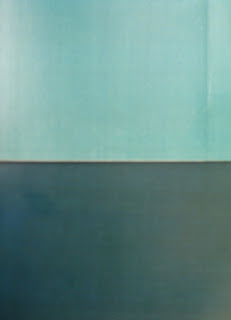
Start by putting some ivory black and white on the palette—and try to mix one of the values you see in the reference print—and then put it down right where you see it in the photo. You should compare the value before you commit to it. So, take a small dab of the mixture you have mixed on your palette and put it directly on the printout when you think it is. It will visually "disappear" on the printout if the value matches. Take the time to remix and remix until it is right. Don’t settle for “close”, get the value exactly right. When you have a match, take a blank sheet of paper and record it with a little patch of paint. Then, move to the next value. See how many different values you find in your photo at the end. Here is a picture of the results of this exercise when I did it this morning.

Here is the startup—with my printout and bit a clean paper to record values.


Here is about midway.


And, here is the printout when it is covered. Keep in mind, this is not the same as making a painting. It is not even a value study. It is simply a piece of paper covered in paint—the benefit is in the process—not the product.


If you do this exercise until you have covered to whole photograph—I am convinced you will have learned something. You may not feel it, or be able to talk about it—but your eyes will be learning when you are doing this exercise. Try doing it everyday for a week for 30 minutes—and you will see an improvement in your work—I promise.

Okay, that is it for now. In my next post, I will teach you how to take this exercise a bit further into a formal study—or even into a painting. But, the process I described is a good exercise in and of itself—and worth doing even it you plan to throw away the finished product. The process will subconsciously teach your eyes to see values in a way you can never learn from a book or from looking at paintings. I am convinced, "learning to see" requires a physical/active engagement--there is no other way.

So, that is what I learned over the holidays, how about you?

All the best, sixtyminutearist.